BMW/MINI Email Design System Library 2.0
BMW/MINI Email Design System Library 2.0
Project Overview
I'm one of the art directors on BMW and MINI's email marketing team, where I design email campaigns and collaborate closely with the Track agency.
This project began when a teammate originally assigned to it recognized I had a deeper working knowledge of Figma's system-building tools and handed it off to me. I started digging in immediately, and as I got further into it, I pushed to get the project formally approved and resourced — sign-off ultimately came from our creative directors and finance team a bit after I'd already begun. That gap between starting and formal approval is really the part I'm proud of: I didn't wait for permission to start solving the problem, but I also made sure the work got the organizational backing it needed to be sustainable.
Status: This project is ongoing. The core system is built and in active use by the design team; documentation is still being finalized, and alignment with our development team began just this past week.
Project Specifications
Design System Specialist
Digital Designer
Email designs for BMW and MINI.
Expanded, refine, and maintain email design system library.
Figma
BMW/MINI Email Design System Library 2.0
BMW/MINI Email Design System Library 2.0

Project Overview
I'm one of the art directors on BMW and MINI's email marketing team, where I design email campaigns and collaborate closely with the Track agency.
This project began when a teammate originally assigned to it recognized I had a deeper working knowledge of Figma's system-building tools and handed it off to me. I started digging in immediately, and as I got further into it, I pushed to get the project formally approved and resourced — sign-off ultimately came from our creative directors and finance team a bit after I'd already begun. That gap between starting and formal approval is really the part I'm proud of: I didn't wait for permission to start solving the problem, but I also made sure the work got the organizational backing it needed to be sustainable.
Status: This project is ongoing. The core system is built and in active use by the design team; documentation is still being finalized, and alignment with our development team began just this past week.
Project Specifications
Design System Specialist
Digital Designer
Email designs for BMW and MINI.
Expanded, refine, and maintain email design system library.
Figma
Related Work
You May Like These Products



The Problem
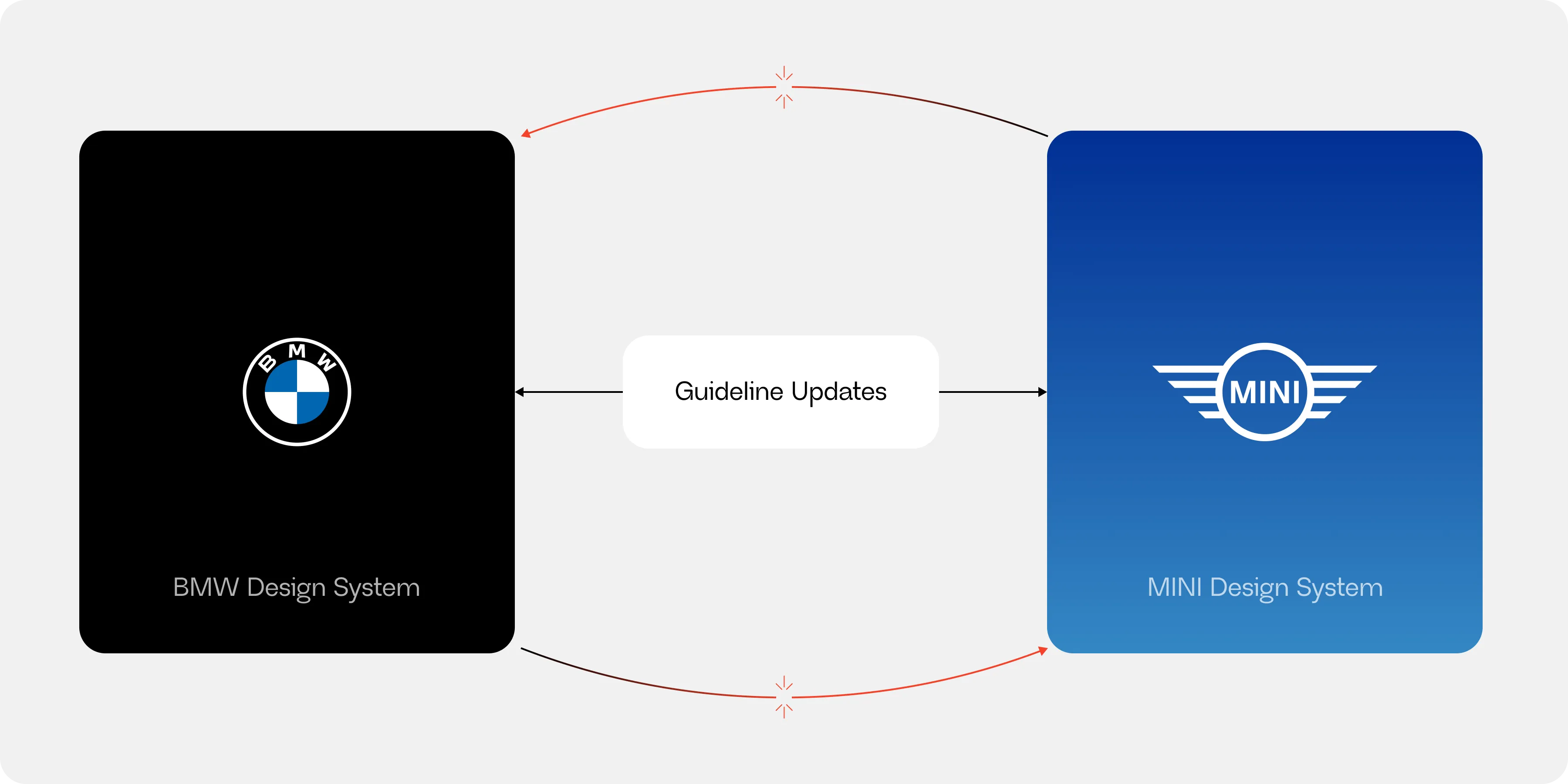
BMW and MINI's email design systems existed as two completely separate libraries — despite the fact that MINI is owned by BMW, and our teams frequently run near-identical email streams for both brands: same modules, same layout logic, just different visual branding (fonts, logos, colors).
In practice, this meant that switching between brands wasn't quick — it was tedious. A designer moving from a BMW project to a MINI project (or vice versa) had to essentially start over in a different system, which ate into time that could otherwise go toward the creative development both brands have specifically asked us to push further.
The problem was compounded by how frequently brand guidelines shifted for both BMW and MINI — BMW especially. With multiple departments and agencies involved, updates didn't always reach our team in a timely way; it wasn't uncommon to discover a guideline document that had existed for months without us knowing. Every time a change surfaced, our team had to manually reconcile it across two disconnected systems instead of updating a single source of truth.
This wasn't a project I was formally assigned. I advocated for it because I could see the inefficiency firsthand, and because I genuinely enjoy this kind of systems work.
The Goals
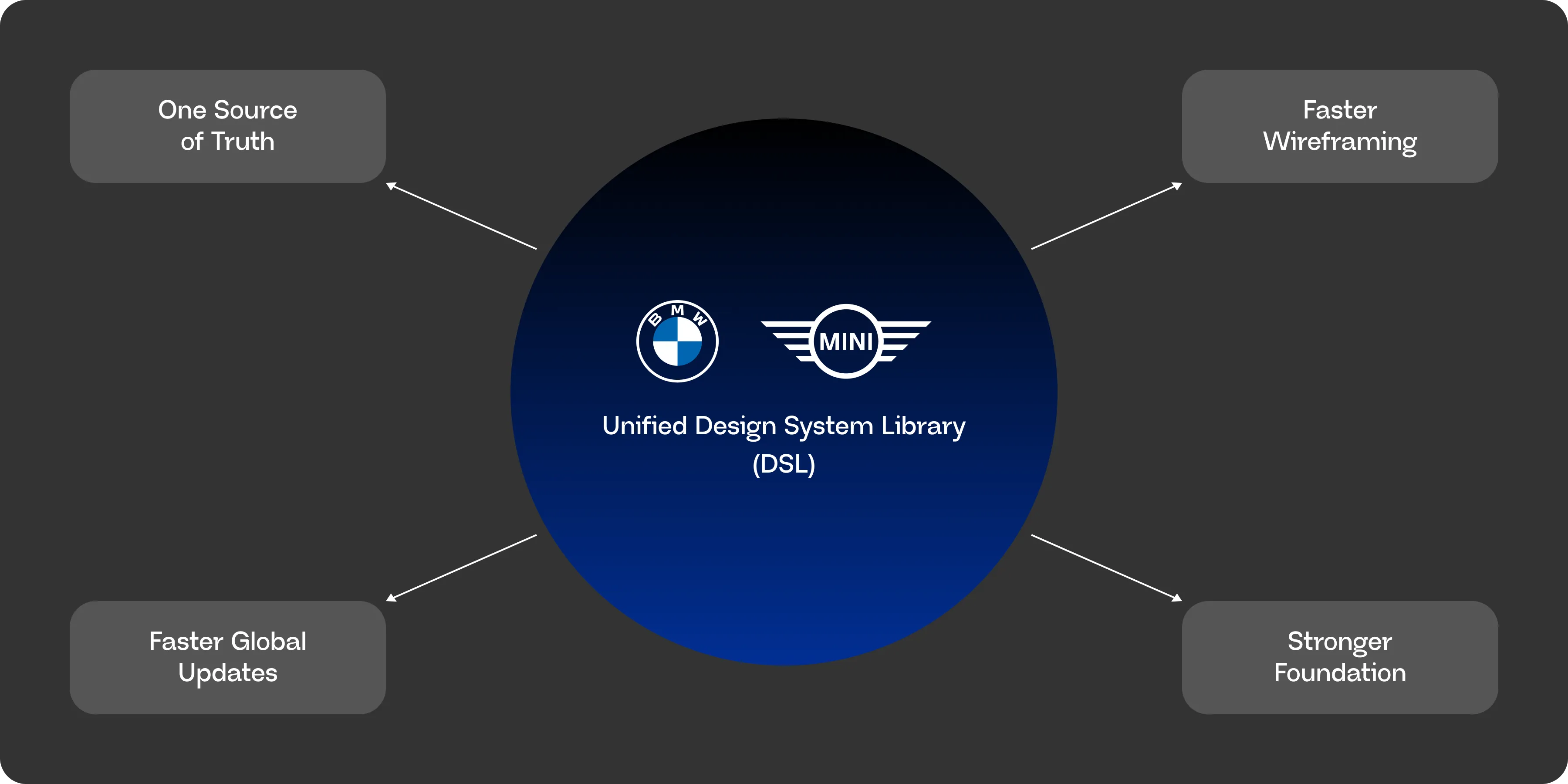
This project was guided by a few clear goals from the start:
One source of truth.
Replace two disconnected DSLs with a single system both brands design from, eliminating the need to reconcile changes across separate files.
Faster global updates.
Build a technical foundation — shared primitives, mode-based switching — so a change like adjusting email width or font weight can propagate everywhere at once, instead of being manually repeated per brand.
Faster wireframing.
Reduce the time it takes to go from a project brief to a working wireframe, especially useful when copywriters are stretched thin.
A stronger foundation, not just a cleanup.
This wasn't meant to just tidy up what existed — the goal was to lay groundwork with more headroom for future efficiency than either original DSL had.
One thing worth stating clearly: this was never meant to be a visual redesign. The look of BMW and MINI's emails hasn't changed — what changed is the infrastructure underneath them. Every goal above is about how the team builds, not what gets built. That distinction matters for how to read the rest of this case study: the visuals you'll see throughout stayed intentionally familiar, while the system powering them changed substantially.
The Audit
Before building the unified system, I spent time auditing both existing DSLs to understand exactly where the inefficiencies lived.
Comparing the two libraries side by side, I found significant duplication of primary components.
- BMW DSL: 53 components
- MINI DSL: 43 components
- Overlapping/duplicate components: 14 components
- 11 duplicated text styles
There were no use of local variables, which would be crucial for brand switching.
Documentation — or the lack of it
Neither system had formal documentation. Usage knowledge lived largely in individual designers' heads, which meant onboarding a new team member — or even picking up a teammate's project — required asking around rather than referencing a guide.
Baseline
Before the unified system, building a single email from a project brief through wireframe took approximately 2-3 hours. This is the baseline I measured the new system's speed against.
The System — Foundations & Architecture
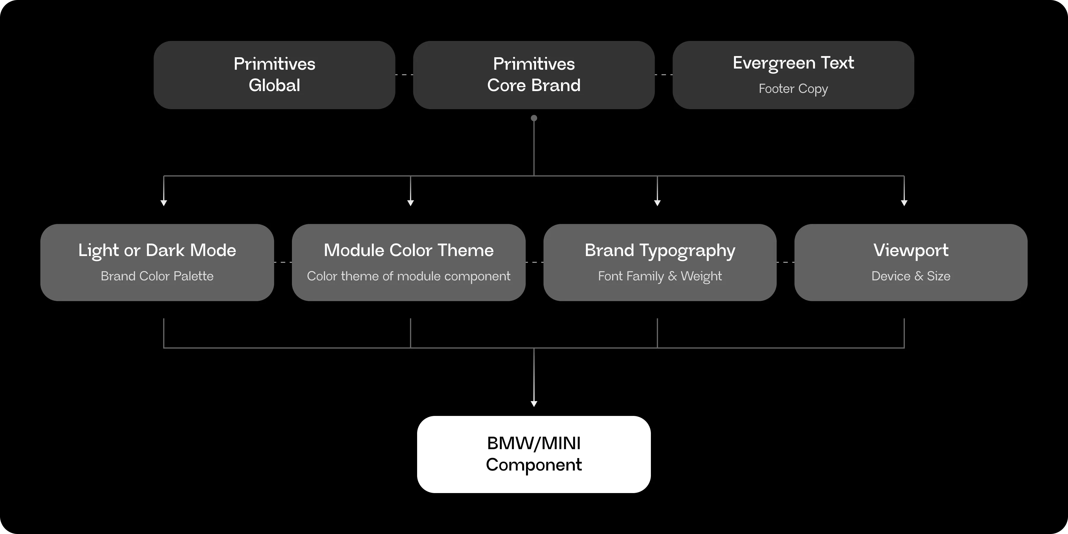
The unified DSL is built on a two-tier variable architecture in Figma: raw values live in primitive collections, and every functional collection references those primitives rather than hardcoding values directly. This keeps each collection small and focused, while ensuring a single update to a primitive propagates everywhere it's used.
Tier 1: Primitives
Primitives – Core Brand: Raw brand values
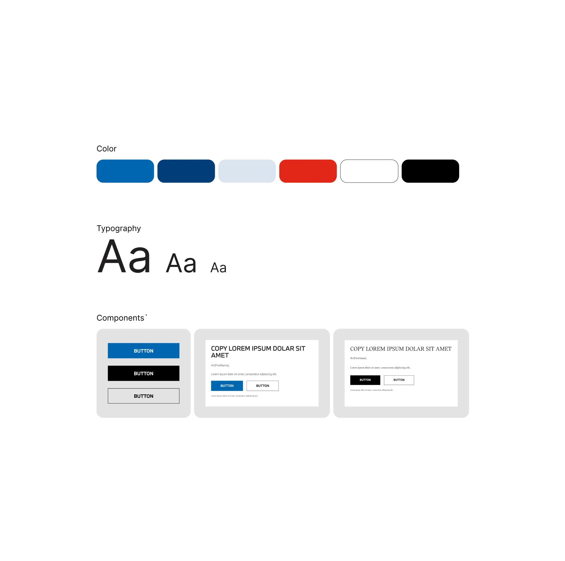
BMW's color palette (BMW Blue, BMW Dark Blue, BMW Light Blue, BMW M Red, plus a BMW-specific neutral scale), MINI's frame colors (Yellow, Orange), and both brands' font families (BMWTypeNext Pro, MINI Serif, MINI Sans Serif), alongside shared globals like White, Black, and an internal-use accent color.
Primitives – Global: Raw numeric scale
A raw numeric scale (2 through 42+, plus a "Round" value of 9999 for full pill/circle radii), surfaced as a dropdown so no one has to type a raw pixel value by hand.
Evergreen Text
Holding from-alias, from-address, and footer copy per brand and division.
Tier 2: Functional Collections
Light or Dark Mode
This is where brand color switching actually lives: Module BG, Banner BG, Text, Icon, Divider, and Button color roles are all defined here, each referencing Primitives values. Housing brand color logic in one place — rather than duplicating it across every other collection — means it only has to be maintained once. Although this collection name may sound unconventional, I factored in the possibility of a future designer — one unfamiliar with Figma — being able to immediately understand the function of the "Light or Dark Mode" collection just from its name.
Module Color Theme
Six BMW themes and four MINI themes, each mapping a module's background fill, primary/secondary button color, primary/secondary icon color, and text roles, all pulling from Light or Dark Mode. I kept this as its own collection rather than folding the themes directly into Light or Dark Mode, so that any theme can still be previewed in dark mode without touching the theme itself. For example, BMW Theme 5 in light mode is a dark blue background with white text for contrast — but if I want to see how that same theme would render in dark mode, I can just flip the appearance setting and check it, without needing to rebuild or reassign anything about Theme 5. Keeping the two collections separate, with Module Color Theme referencing Light or Dark Mode rather than merging into it, is what makes that kind of quick testing possible.
Brand Typography + Icon
Controlling font family and weight for Heading, Copy, Button, and App text per brand — including the switch from MINI Serif to MINI Sans Serif for limited-edition drops
Viewport
Controlling email width, padding scale, gap scale, text sizing, and layout direction for desktop and mobile devices.
Brand App Variables
App-specific values unrelated to email layouts, and outside the scope of this system
Example 1: The Module Component
The clearest way to see this system work is through the module component — the most-used building block in every email we design. A single module component can flip between six BMW themes or MINI's theme set, and every property (background, button colors, icon colors, text roles) updates together, because each theme is really just a named bundle of references back to Light or Dark Mode.
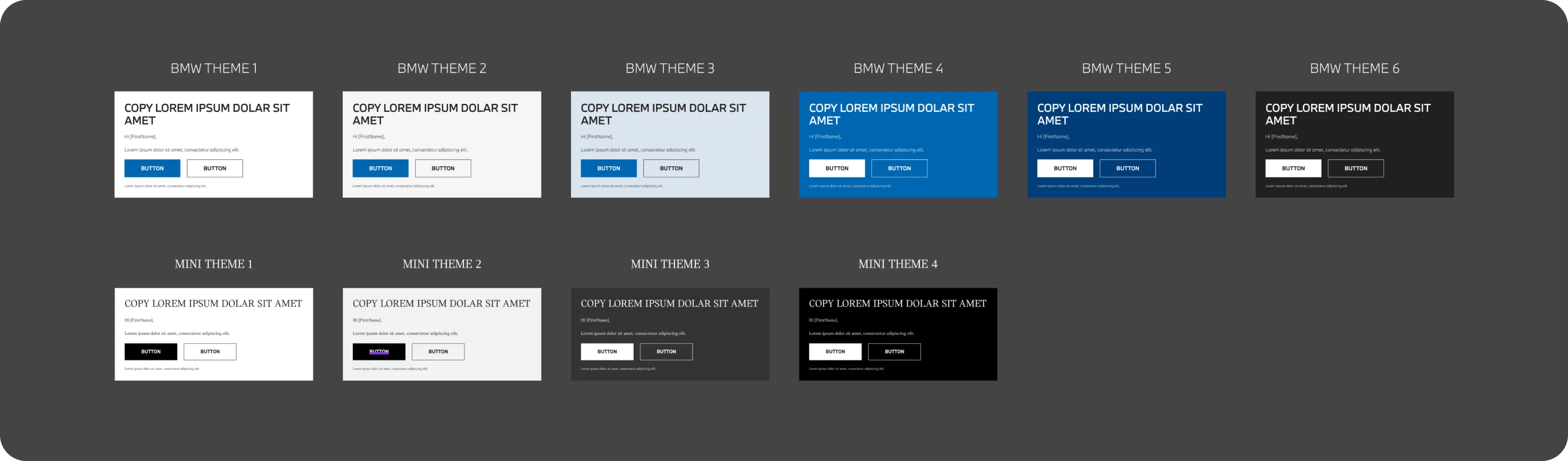
This is also where the naming convention matters. Themes are named consistently by number (Theme 1–6) rather than by describing the color, and color/text/icon roles are named by function (Primary, Secondary, Tertiary, Quaternary) rather than by hue. This wasn't just a stylistic choice — it was necessary. BMW's themes map to its blue-driven color palette, but MINI's module themes are entirely neutral (white, gray, black), since MINI's actual brand colors are reserved for imagery and frame treatments, not module backgrounds. Naming a theme "Blue Theme" would make no sense once applied to MINI. Keeping names functional rather than descriptive means the same naming pattern works across both brands, regardless of how different their actual palettes are — and the system stays flexible if either brand's palette shifts down the line.
Example 2: The Creative Proof Template
The module component shows how the system handles color and theming. The Creative Proof template — the standardized document sent to clients for every project — shows how the system handles brand switching at a structural level.
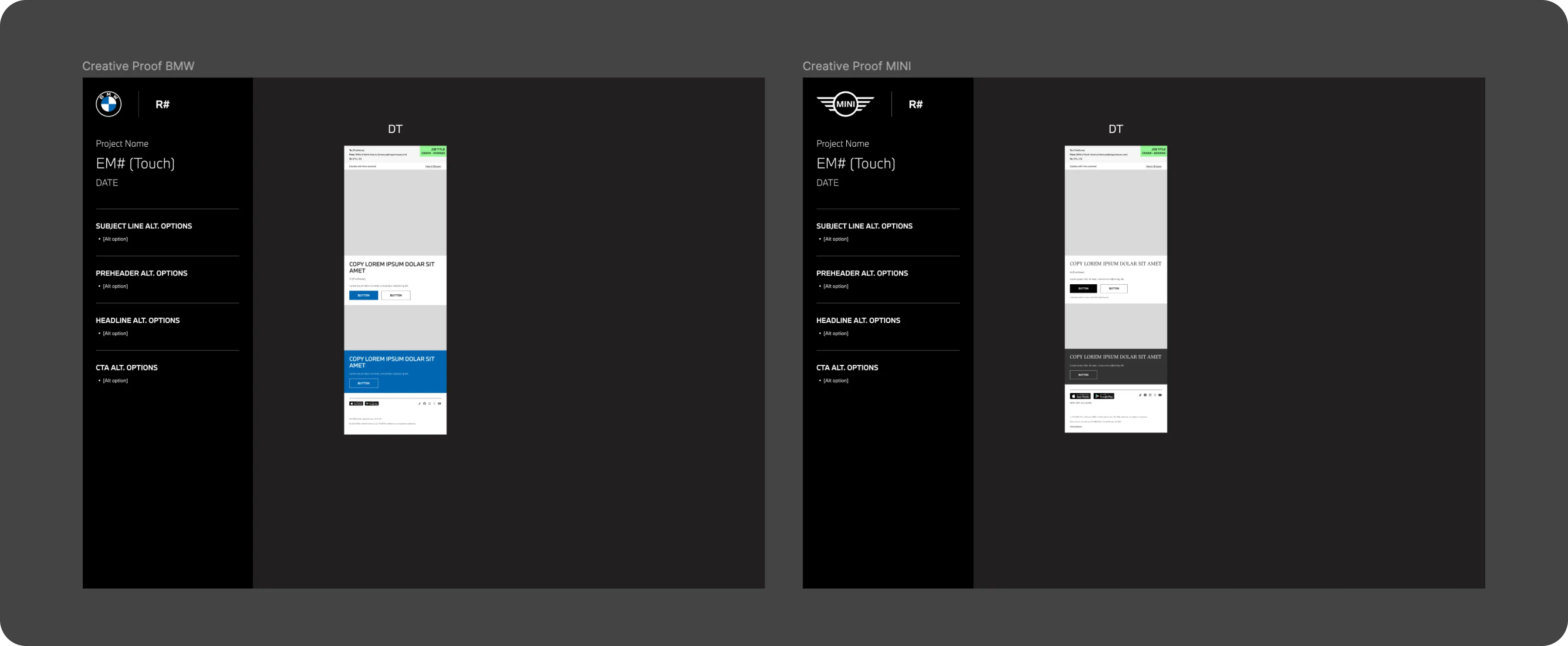
Every Creative Proof consists of a sidebar (project name, send date, subject line/preheader/headline/CTA alternates) and an email component made up of an email label and footer, with an empty "email body" slot in between where the actual modules get inserted. Because brand appearance is applied at the page level — not the individual component level — a BMW Creative Proof page and a MINI Creative Proof page automatically render the correct logo, typography, and colors the moment an instance is dropped in. Since BMW is the default mode, any instance placed into a MINI-mode page automatically switches over from BMW to MINI branding, without needing to be manually reassigned.
This is the same page-level appearance logic described earlier in the designer workflow section — but the Creative Proof is a good example to point to specifically, since it's client-facing and used on every single project, making it the template where brand-switching reliability matters most.
How a Change Actually Propagates
Because everything routes back through Primitives, a single value change cascades automatically. If BMW Blue needs to shift to a new hex code, that one edit in Primitives – Core Brand updates it everywhere Light or Dark Mode references it — which updates every Module Color Theme that references that — without touching the module component itself. This is the same mechanism that's letting the system absorb the development team's current global change requests (like adjusting email width) without needing to touch every individual file by hand.
Standardizing Designer Workflow
Beyond the technical architecture, part of this project involved standardizing how the team works, not just the system itself.
Before the unified DSL, I noticed that each designer on the team had developed their own personal workflow for building emails — different file structures, different starting points, different habits. That wasn't necessarily a problem on its own, but it became one whenever a designer needed to pick up a teammate's project, which happens often when workloads shift or someone's out. Jumping into an unfamiliar file structure slowed everyone down.
To address this, I built standardized Figma templates as part of the DSL rollout — including the Creative Proof, the document sent to clients for every project, made up of a sidebar and an email component with an empty "email body" slot where modules get inserted. Rather than applying brand appearance settings to individual components, I applied them at the page level — meaning every instance placed on a MINI page automatically inherits MINI branding, and every instance on a BMW page automatically inherits BMW branding, without any manual switching per component.
This was a deliberate architectural choice: setting appearance at the higher page level rather than the individual instance level keeps the system simpler to maintain and far less error-prone, since a designer can't accidentally leave one component on the wrong brand mode.
BMW is set as the default mode, since it's listed first in the system. Because I work primarily on MINI, this means that whenever I bring components into a MINI template, they automatically switch over from the BMW default to MINI branding — a small detail, but one that reflects how the page-level appearance logic works in practice day to day.
This has made project handoffs between designers noticeably smoother, since picking up someone else's file no longer means first figuring out how they organized it.
Cross-functional Impact — Copywriter Workflow
One of the clearest wins from this project has been how it's changed the working relationship between design and copy.
Our copywriters are often stretched thin across multiple projects. Previously, the design process for an email typically waited on a finished copy deck before wireframing could begin in earnest. With the unified system now letting me move from a project brief straight into a wireframe in as little as 30 minutes, that dependency has loosened.
Now, when a copywriter is slammed, I can go directly to the project brief and build out wireframes myself — giving the copywriter something visual to react to and adjust, rather than starting from a blank page under time pressure. This has taken pressure off their workload and given them an easier way to see how their copy will actually look in context, earlier in the process.
This shift reflects something the DSL project was ultimately about beyond just speed — reducing friction between roles on the team, not just within design itself.
Documentation — In Progress
Documentation is the piece of this project I'm still actively building out.
Because the goal of the unified DSL is for any designer on the team to be able to use it confidently — not just the person who built it — I've been writing the usage guides as though the reader has no prior Figma knowledge. That means spelling out things an experienced Figma user might take for granted: how to apply a mode, where a given variable lives, what happens when you switch a page's appearance setting.
Right now, this documentation exists mostly as an outline I've been building over time, rather than a finished, designed set of guides.
I'm treating this deliberately as a later phase of the project rather than something to rush. The system itself needed to be stable and validated through real use first — writing guides for a structure that might still change would mean rewriting them later anyway. Now that the architecture has held up in practice, formal documentation is the next major piece of this project.
Governance Model
As this project matures, I've also been thinking through how the DSL should be maintained going forward — not just by me, but as a shared team resource.
Ownership
I'm currently the primary owner and maintainer of the system, a natural extension of having built it. That said, the goal isn't for it to depend entirely on one person.
Contribution path
I actively encourage other designers on the team to contribute, particularly for BMW-specific updates. Since I work primarily on MINI, my teammates who work more closely with BMW often have deeper insight into that brand's client history and evolving guidelines — insight the system should reflect.
Review cadence
Our team already has a weekly meeting where we recap what's changed in the DSL and discuss upcoming updates for both BMW and MINI. This meeting naturally functions as the system's review checkpoint, so formalizing governance didn't mean adding a new process — just recognizing the one we already had.
Change classification
In practice, changes tend to fall into two categories:
- Internal/structural changes — e.g., adjusting a component from fixed to fill sizing — which are low-risk and don't affect what a client sees. These move quickly, often pushed in small increments.
- Client-visible changes — which involve more visibility and alignment before rolling out.
What's next: dev alignment
As our development team has started requesting global changes, a new governance layer is forming: a process for how DSL updates get communicated to and validated with engineering, rather than staying purely internal to design. This is actively taking shape now, alongside conversations with more client-facing teammates to make sure everyone stays aligned as the system scales.
Current Status & Next Steps
This project is very much a living system, not a finished one, and I want to be upfront about where things currently stand.
Where the system is now
The core architecture — primitives, brand switching, viewport handling, module theming — is built and in active daily use across the design team. It has already changed how the team works day to day, from wireframing speed to how projects get handed off between designers.
Dev alignment: just beginning
Engineering involvement started within the past week, prompted by the development team requesting global changes the system was specifically built to support (like adjusting email width or font weight across both brands at once). At this stage, I don't yet have the details of what that collaboration will look like long-term — but the system was intentionally built to make that handoff smoother when it happens, rather than reworked to accommodate it after the fact.
Documentation: in progress
As covered earlier, formal documentation is being written now that the system's architecture has proven stable through real use. This is the next major deliverable.
Client-facing alignment
Alongside dev conversations, I'm also working to align with more client-facing teammates to make sure everyone across the team — not just the design side — understands how the system works and where it's headed.
Looking ahead
Next steps include:
- Finalizing and designing the documentation guides
- Establishing a concrete process for dev-facing change requests
- Closing out the iconography integration into the mode system
- Building out measurement — starting to track things like wireframe time and component usage more formally, now that the system is stable enough to measure against
Outcomes So Far
Wireframing Speed
Building a full email — from project brief through wireframe — now takes roughly 30 minutes, down from a process that previously took a few hours. This is the clearest, most direct outcome of the unified system so far.
Component Consolidation
53 components in old BMW DSL + 43 components in old MINI DSL = 90 components in new BMW/MINI DSL 2.0
Workflow Consistency
Standardized templates and page-level brand switching have made it noticeably easier for designers to pick up each other's projects — a direct response to how often the team shares work when bandwidth shifts.
Copywriter Collaboration
The ability to wireframe directly from a project brief, without waiting on a finished copy deck, has eased pressure on copywriters during high-workload periods and given them an earlier, visual reference point for their copy.
Early Dev Interest
Within the past week, our development team began requesting global changes — like adjustments to email width or font weight — that this system was specifically architected to support. While this collaboration is just beginning, it's an early signal that the technical foundation is solving a real problem beyond just the design team's workflow.
Revisiting the Goals
Every outcome above maps back to a goal stated at the outset: one source of truth, faster global updates, faster wireframing, a stronger foundation. None of it required changing how BMW or MINI's emails actually look — which was the point. The gains came from the system underneath, not a visual refresh.
What I Don't Have Yet — and My Plan for It
I want to be transparent that formal measurement is still ahead of me, not behind me. Right now, my evidence is largely observational. Going forward, I plan to track this more rigorously: logging build time and DSL component usage per email, monitoring how often components get detached or customized outside the system, and — once documentation ships — watching whether team questions shift from asking me directly to self-serving through the guides. I'd rather build this measurement discipline now than wait until I have sophisticated tooling to start.
Reflection
This project taught me as much about how I want to work as it did about design systems themselves.
I got this project because a teammate recognized I was better suited to it than he was — and once I had it, I didn't wait for formal approval to start. I began working through the inefficiency immediately, and pushed to get the project properly resourced and approved once I could see how much it mattered. That's something I want to keep doing: taking real ownership the moment I see an opportunity, rather than waiting for permission to matter.
I also learned to be comfortable building in public, in progress. It would have been easier to wait until dev handoff was complete, documentation was polished, and I had clean metrics before calling this a case study. But I think there's more value in showing the actual shape of real systems work — including the parts that are still being figured out — than in only presenting finished, tidy outcomes.
Working within BMW and MINI's brand structure also sharpened how I think about designing inside constraints: shared architecture, sub-brand exceptions, guidelines that shift without much warning. That kind of discipline — building something scalable and maintainable while still flexible enough to absorb the unexpected — feels like exactly the muscle a larger, more structured design practice would ask me to keep building.
This system is still growing. But I'm proud of the foundation, and I'm looking forward to seeing it through — documentation, dev handoff, and real measurement included.

